
Introduction — why start with html and css ?
If you’re learning web development, nothing beats the clarity of building something real from the ground up. A to-do app is a perfect first project because it’s small, immediately useful, and shows how structure and style work together. In this post I’ll show you how a simple, elegant to-do interface can be built using html and css (with a note later on adding minimal JavaScript for behavior). You’ll get semantic markup, responsive layout, accessibility tips, and an AdSense-friendly publishing checklist so the article you publish is original and compliant.
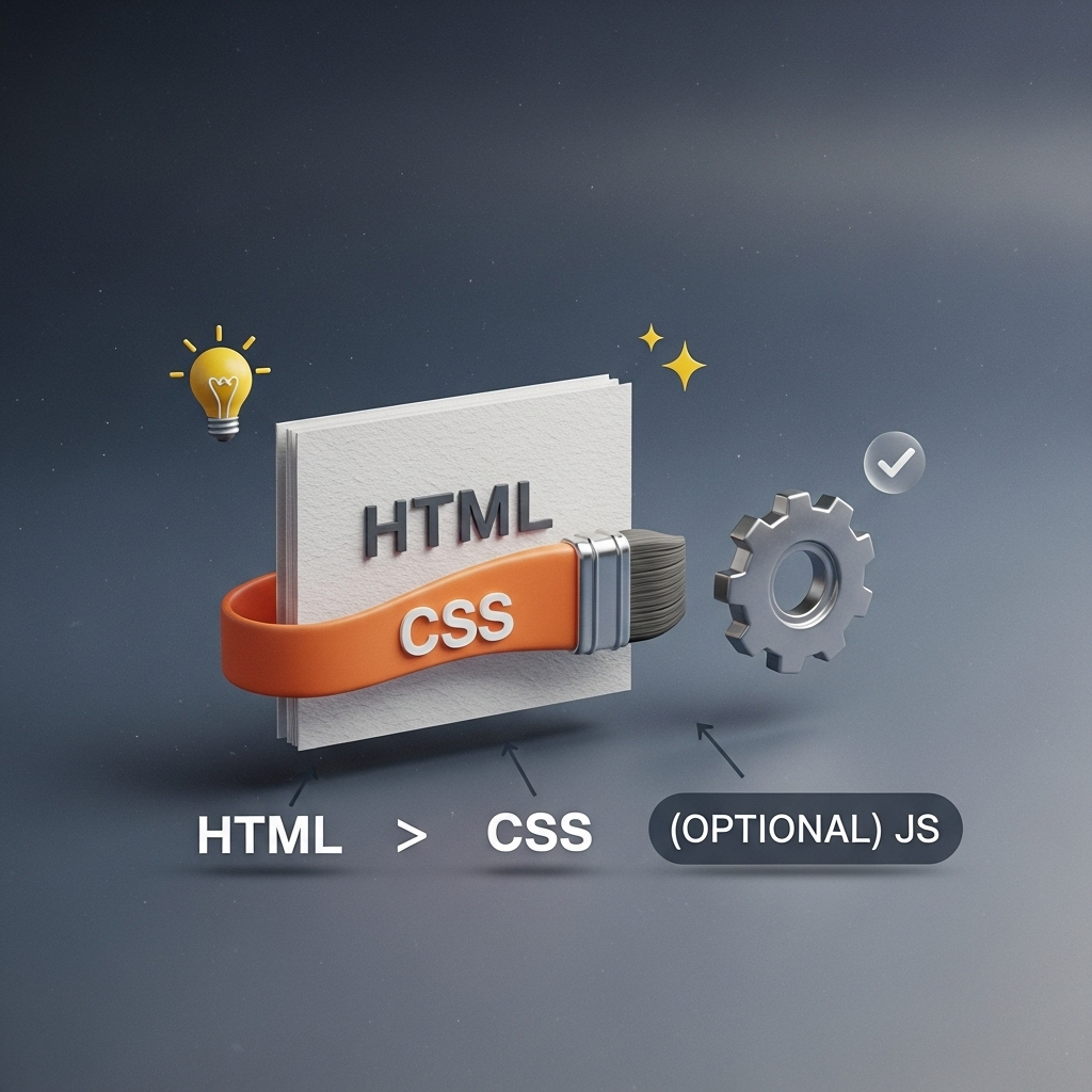
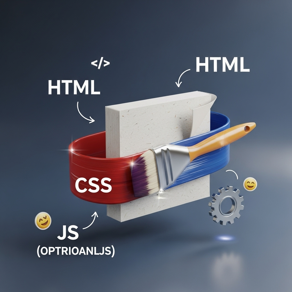
Comparison: What HTML does vs what CSS does (and where JS fits)
Before we start building, let’s be clear about roles:
| Layer | Responsibility | Quick tip |
|---|---|---|
| HTML | Structure and meaning — headings, lists, forms, semantic containers | Use the right tag for the job so browsers and assistive tech understand content. MDN Web Docs |
| CSS | Visual layout and presentation — spacing, color, responsive rules | Prefer Flexbox/Grid for layout rather than hacks. MDN Web Docs+1 |
| JavaScript | Behavior — adding, removing, persisting tasks (e.g., localStorage) | Add JS progressively so content remains meaningful without scripts. freeCodeCamp |
Practical perspective: start with semantic HTML, then style with CSS. Only add JS when the UI is solid — this leads to a more reliable, accessible product.
The plan: what we’ll build
- Semantic markup for a to-do list (form to add, list to display tasks).
- CSS layout using Flexbox (or Grid for wider control) so it looks modern and works on mobile. MDN Web Docs+1
- Accessibility and SEO touches so the page is usable and finds search engines. MDN Web DocsW3C
- Guidance to publish as an original, AdSense-friendly article. Google Help
Step 1 — Semantic HTML (skeleton)
Start with meaningful tags so content is machine-readable. Below is a compact example:
<main>
  <header>
    <h1>My Daily To-Do</h1>
    <p class="hint">Quick tasks for today</p>
  </header>

  <section aria-labelledby="add-task">
    <h2 id="add-task">Add a task</h2>
    <form id="todo-form">
      <label for="task">Task</label>
      <input id="task" name="task" type="text" required />
      <button type="submit">Add</button>
    </form>
  </section>

  <section aria-labelledby="tasks">
    <h2 id="tasks">Tasks</h2>
    <ul id="todo-list" aria-live="polite"></ul>
  </section>
</main>
Why this matters: semantic tags and labels improve accessibility and searchability (screen readers, search bots). Use aria-live for dynamic updates so assistive tech is notified. MDN Web Docs
Step 2 — Clean, modern CSS (layout + microinteractions)
Use CSS to make the list readable and responsive. Use variables for theme and keep styles modular.
:root{
  --bg: #f7fafc;
  --card: #fff;
  --accent: #2ecc71;
  --text: #0f1720;
  --radius: 12px;
}
body{
  font-family: system-ui, -apple-system, "Segoe UI", Roboto, "Helvetica Neue", Arial;
  background: var(--bg);
  color: var(--text);
  display:flex;
  justify-content:center;
  padding:3rem;
}
.card{
  background:var(--card);
  border-radius:var(--radius);
  box-shadow:0 6px 20px rgba(13,30,40,.08);
  width:100%;
  max-width:720px;
  padding:2rem;
}
#todo-list{
  display:flex;
  flex-direction:column;
  gap:.5rem;
  margin-top:1rem;
}
.task{
  display:flex;
  align-items:center;
  justify-content:space-between;
  padding:.75rem 1rem;
  border-radius:10px;
  background:linear-gradient(180deg,#fff,#f6f9fb);
}
@media (max-width:600px){
  .card{padding:1rem}
}
Layout choice: Flexbox works perfectly for vertical lists and small layouts; use CSS Grid if you need multi-column control or a dashboard-like layout. MDN Web Docs+1
Small design details that make a big UX difference
- Touch targets: make buttons at least 44×44 px for mobile comfort.
- Visual hierarchy: bold the task title, lighter for metadata (time/priority).
- Microfeedback: subtle transitions (e.g.,
transform: translateY(-2px)on hover) make the app feel polished. - Readable typography: system fonts + careful line height improve perceived performance and legibility.
Accessibility & SEO: non-negotiables
- Use semantic elements (
<main>,<header>, headings in order). MDN Web Docs - Provide
labelfor every form control and userole/ariaonly when semantics fall short. MDN Web Docs - Ensure color contrast meets WCAG AA (contrast ratio ≥ 4.5:1 for body text). W3C
These steps not only help users with disabilities, they also strengthen your content’s search performance and retention.
Behavior: a short note about JavaScript & persistence
A fully interactive to-do requires JS to add/remove tasks and maybe persist them with localStorage. If you want to keep the project limited to html and css, consider this approach:
- Build the UI first and make the form functional in a progressive enhancement plan.
- Later add a small script (50–120 lines) to handle CRUD operations and
localStoragefor persistence — freeCodeCamp has a clear step-by-step if you need a reference. freeCodeCamp
Example workflow I used (personal insight)
I often design the UI first in HTML/CSS, then hand it to friends for usability feedback before adding JS. That early feedback prevents wasted coding time: sometimes a simpler layout made the app faster to scan, and users preferred a compact “mark done” affordance over editable task titles. It sounds small, but these tiny choices affect retention.
Visuals & publishing tips (for engagement and AdSense)
- Screenshots & GIFs: show the app on mobile and desktop. Use crisp 16:9 hero images and a small animated GIF to demonstrate adding a task.
- Info table: summarize the tech choices (HTML/CSS, layout method, accessibility checks).
- AdSense readiness: write original content and avoid scraped or low-value content — Google’s AdSense policies emphasize publisher responsibility for content quality. Link to the official guidance when publishing. Google Help+1
Suggested table to include in your post
| Element | Why it matters | Where to test |
|---|---|---|
| Semantic HTML | Accessibility & SEO | Browser + screen reader |
| Flexbox / Grid | Responsive layout | DevTools (responsive mode) |
| Contrast & Labels | WCAG conformance | Contrast checkers, accessibility audits |
Final checklist before you hit publish
- ✅ Original article copy (no AI-plagiarism / spun content)
- ✅ Semantic HTML and visible form labels
- ✅ Mobile-first CSS with Flexbox/Grid layout
- ✅ WCAG basic checks (contrast, keyboard operability) W3C
- ✅ Images optimized, alt text present (helps SEO)
- ✅ AdSense policy review and site compliance. Google Help
Conclusion & next steps
Building a to-do app with html and css is an excellent exercise in deliberate web design. Focus first on meaningful structure, then craft a responsive, readable UI with CSS. Add JavaScript only when your markup and styles are solid — this saved me many reworks during early projects. If you want, you can follow up and I’ll supply a compact JavaScript file to make the UI interactive and persist tasks to localStorage.
Call to Action
Tried the steps above? Share your HTML/CSS snippet or a screenshot — I’ll review it and suggest small changes to improve accessibility and layout. If you’d like a ready-to-paste starter kit (HTML + CSS + optional JS), say “Send starter kit” and I’ll provide it.
References & further reading
- Semantic HTML and accessibility basics (MDN). MDN Web Docs+1
- CSS Layout: Flexbox and Grid (MDN). MDN Web Docs+1
- To-do app examples &
localStoragetutorials (freeCodeCamp). freeCodeCamp - Web Content Accessibility Guidelines (W3C). W3C
- Google AdSense content and publisher policies. Google Help+1